The BrooKs Institute
Role: Creative Director & UX Lead
The Brooks Institute for Animal Rights Law and Policy is a non-profit organization dedicated to funding and supporting academic research, public policy, and other initiatives that advance animal rights and protection. In their own words, the Brooks Institute is “pursuing a paradigm shift in human responsibility towards, and value of, non-human animals by advancing animal law, animal policy, and related interdisciplinary studies”.
I came on board in 2017 to help launch the foundation. My primary tasks were to establish their brand identity and develop a UX and visual design strategy for the Brooks Institute’s web presence that would grow with them as they established themselves in academic and non-profit spheres.
Read more: Branding | Navigation | Search & Filtering
Branding
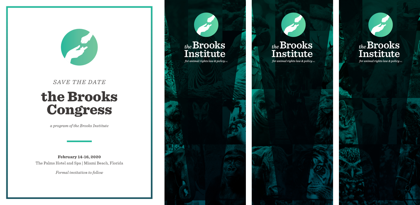
The challenge: building a brand with both the conservative gravitas to appeal to academic partners and wealthy donors and a modern look toward the future that allows the founder's deep love for animals to shine through.
Deep forest green as the primary brand color is an obvious nod to environmentalism but also a jewel tone evoking traditional college style. I balanced it with a bright sea foam green that pops on screen. The fonts were chosen with the same intention: Sentinel is a classic slab serif and Montserrat is easy to read and modern; both fonts offer a lot of flexibility in weight and style to establish visual hierarchy for a text-heavy brand. To underscore the foundation’s goals without distracting from its academic mission, I decided to bring in wildlife photography as a textural background element.
Over the course of the project, I developed a logo, brand style guide, and a variety of print and digital marketing collateral in addition to the website design.


Navigation & site architecture
The stakeholders wanted to combine a wealth of information about the foundation’s origins and goals along with a robust academic library, which proved a major organizational challenge. I set up a series of brainstorming sessions with BI stakeholders to figure out what types of content they expected to need both for launch and in the future so we could begin to develop our site map. In terms of the UI, we knew we would need to employ drop-downs due the complexity of the nav but wanted to keep the experience as streamlined as possible. We also needed to account for global search and social media sharing within the navigation ecosystem.
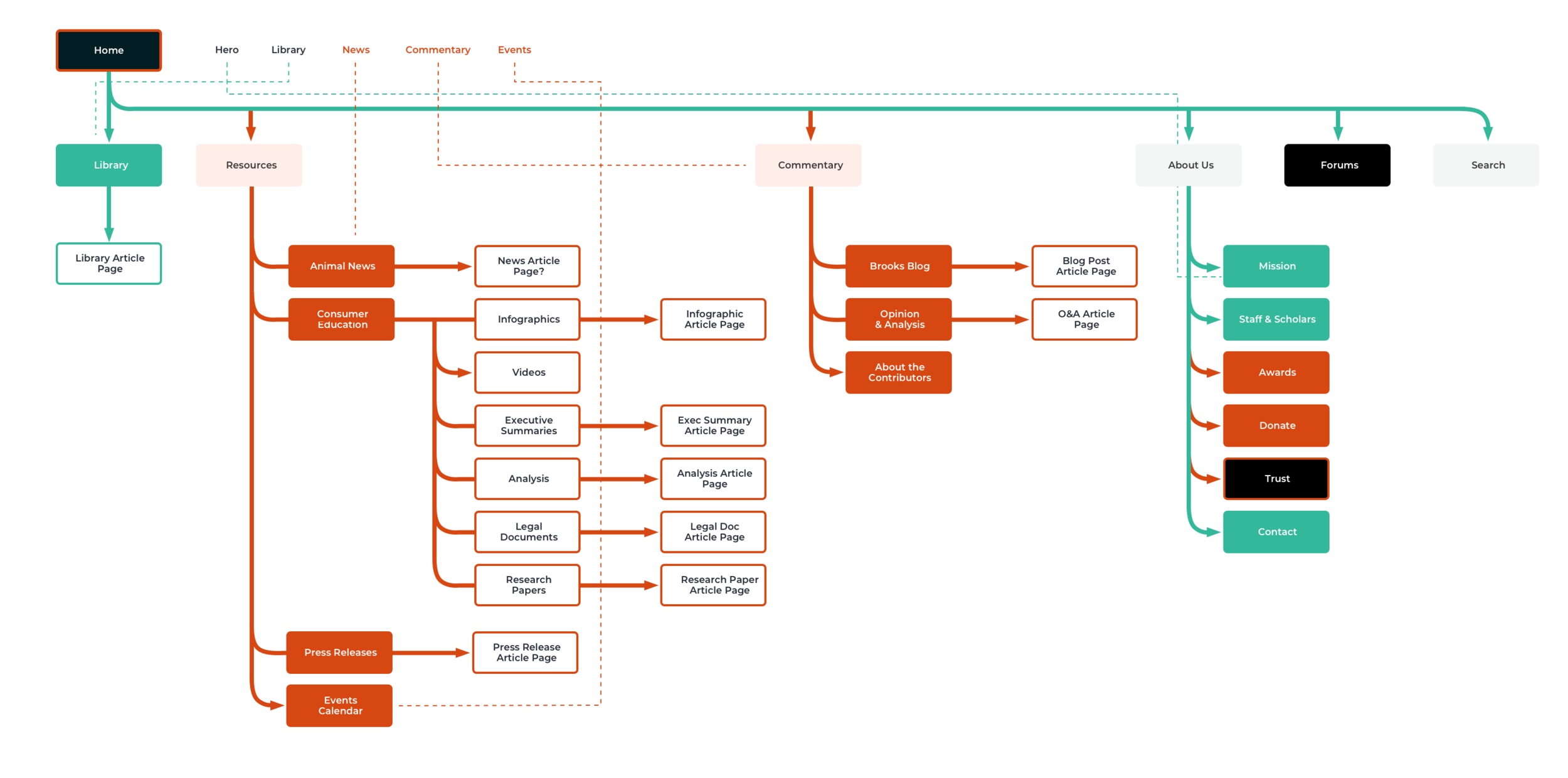
Early site map draft

Screen recording of desktop nav prototype

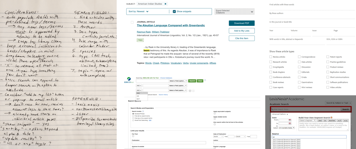
Search & Filtering
The target audience for the resource library professional users in the academic and legal fields, so we chose to focus on the desktop experience first, though mobile friendly design for the overall site remained a priority. We expected the majority of traffic to this portion of the site would be serious researchers who would prefer to access the filters and results side by side on a larger screen.
As part of our research, we reviewed several major academic and legal research platforms, including jSTOR, LexisNexis, and a number of university library catalogs. Our biggest challenge would be figuring out how to combine the robust capabilities of those well-known sources with a more streamlined and modern UI.