P&G Grocery Rewards
Role: UX & Design Lead
Our longtime client Procter & Gamble runs 3-4 promotional campaigns per quarter under their Scale program dedicated to driving product purchases at regional grocery store partners. Shoppers can receive rewards (usually prepaid gift cards) for buying P&G products by simply shopping the offer and uploading their receipt. Programs are customized based on campaign and target and supported by in-store media and digital ads.
For the past several years, we have supported P&G's Scale campaigns with an individual branded redemption microsite for each program, but we found over time that the production was time consuming and our client was missing out on major opportunities to collect shopper data and build brand engagement with shoppers by making each promotion a one-off. Our solution: P&G Grocery Rewards, a single destination to consolidate their Scale purchase incentive promotions and launch a customer loyalty program.
Read more: TAGS | Strategy | User Journey | Redemption Flow | Account Features | Next Steps
TAGS: building on existing technology
Several years ago, Blue Chip developed a proprietary proof-of-purchase rewards platform called TAGS to support P&G's Scale campaigns—the name stands for Take Action Get Stuff. Users upload (or mail in) a picture of their store receipt to confirm they've purchased the required amount of qualifying products at a participating retailer and receive their reward. Our software platform integrates with Snipp to provide receipt processing and validation, reward fulfillment, error messaging and customer support. To date, we've executed more than 70 programs for P&G (and several other clients including Flow Water and RXBAR).
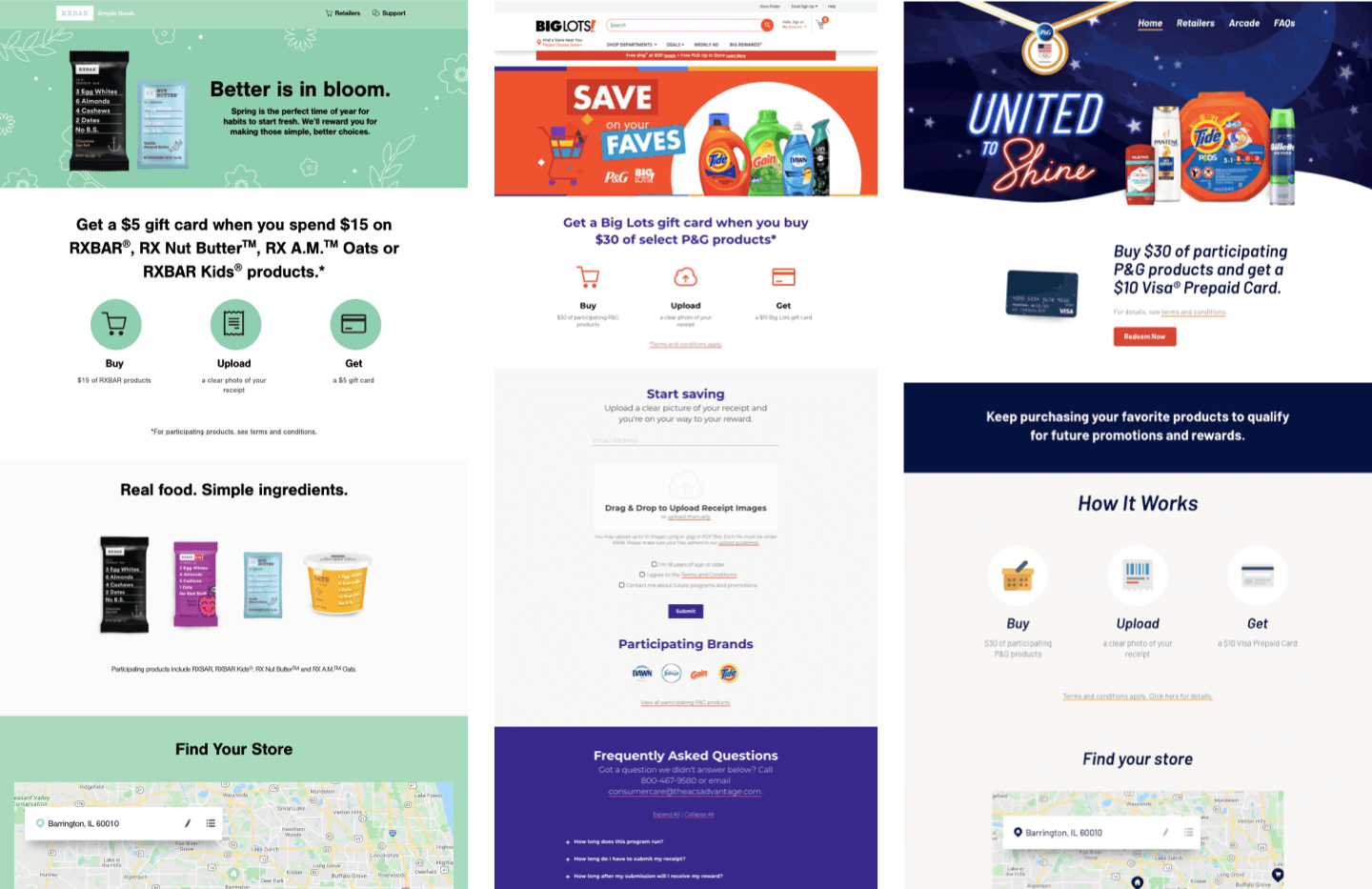
Past TAGS programs
Main components
Custom microsite or landing page for the duration of the promotion
Offer: usually a prepaid giftcard tied to a dollar amount purchase of qualifying products
3 steps to reward messaging: Buy, Upload, Get
Store locator
Upgrades: sweeps integration, games, bilingual option
Rewards Hub Strategy
We knew there was a lot of potential to update and evolve the TAGS experience for P&G. We realized we could leverage the familiar 3-step process and redemption engine we'd already created and develop a larger customer destination around it to build brand loyalty around the Scale program and P&G brands and further engage the shopper with new features.
Product Vision
Centralize all P&G Scale programs to shift the user experience from participation in one-off programs to connected campaigns within the shopper’s region.
Shoppers will now also have access to enhanced features to track the status of their reward redemption, learn about future programs in their region and see how many rewards they have earned over time.
provide users with relevant, engaging content to emphasize "one-stop shopping” at grocery.
increase recognition of P&G Scale programs at grocery with shoppers.
Business Goal
support P&G marketing and sales by collecting user data on shopping preferences, program usage and shopping habits to help marketing and sales refine and tailor their Scale program and larger marketing initiatives.
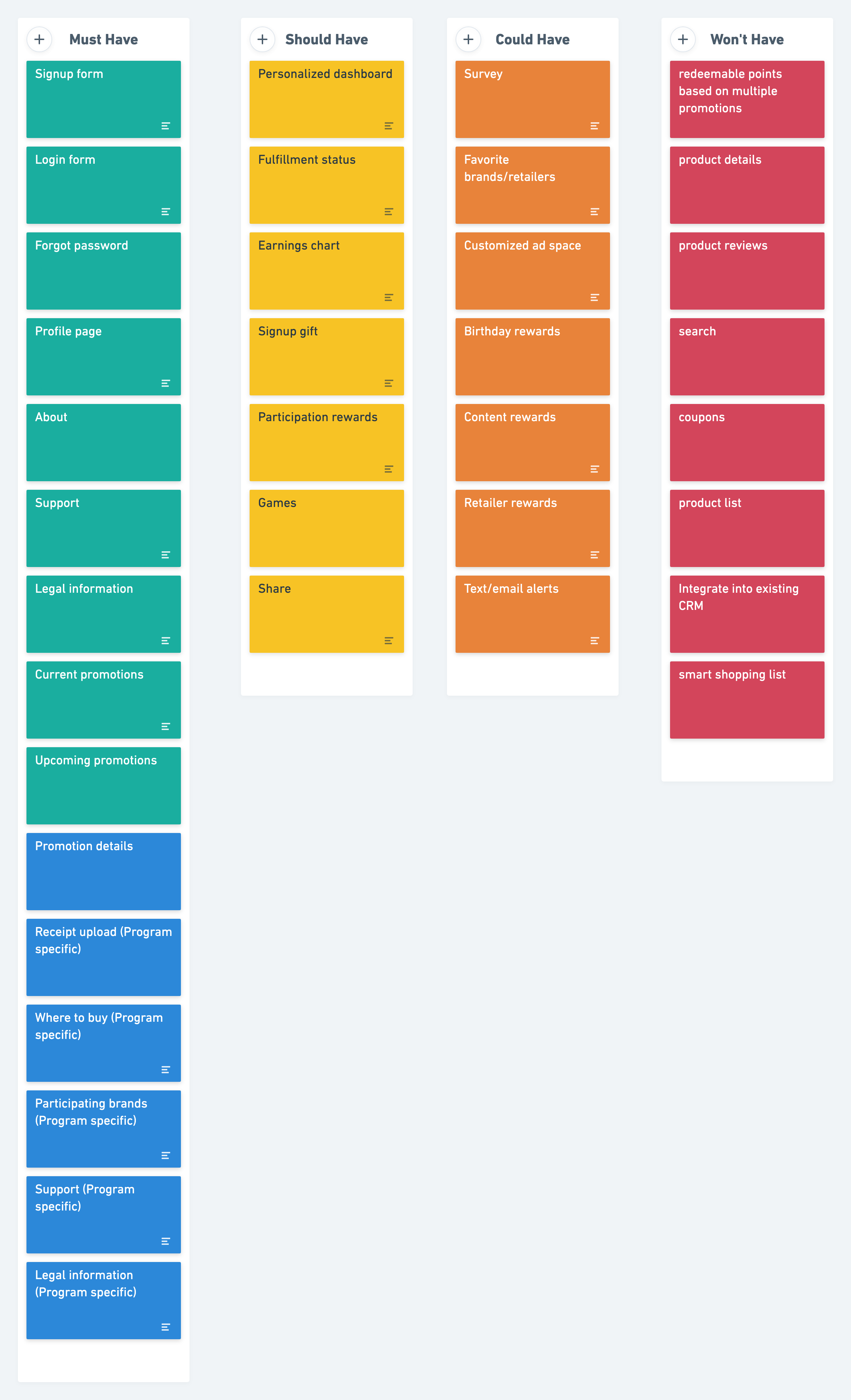
MoSCoW chart from early feature planning
User Journey
We expect the majority of users will arrive at the Rewards Hub the same way they participating in TAGS programs in the past: via vanity URL directly to a promotion page from in-store or digital media with the goal of learning about the program and redeeming a reward. However, we hope to steadily build traffic to the Rewards Hub as a destination on its own, by both organic search and repeat visits from satisfied customers. We needed to consider carefully how to make the experience simple and satisfying for these different audiences.
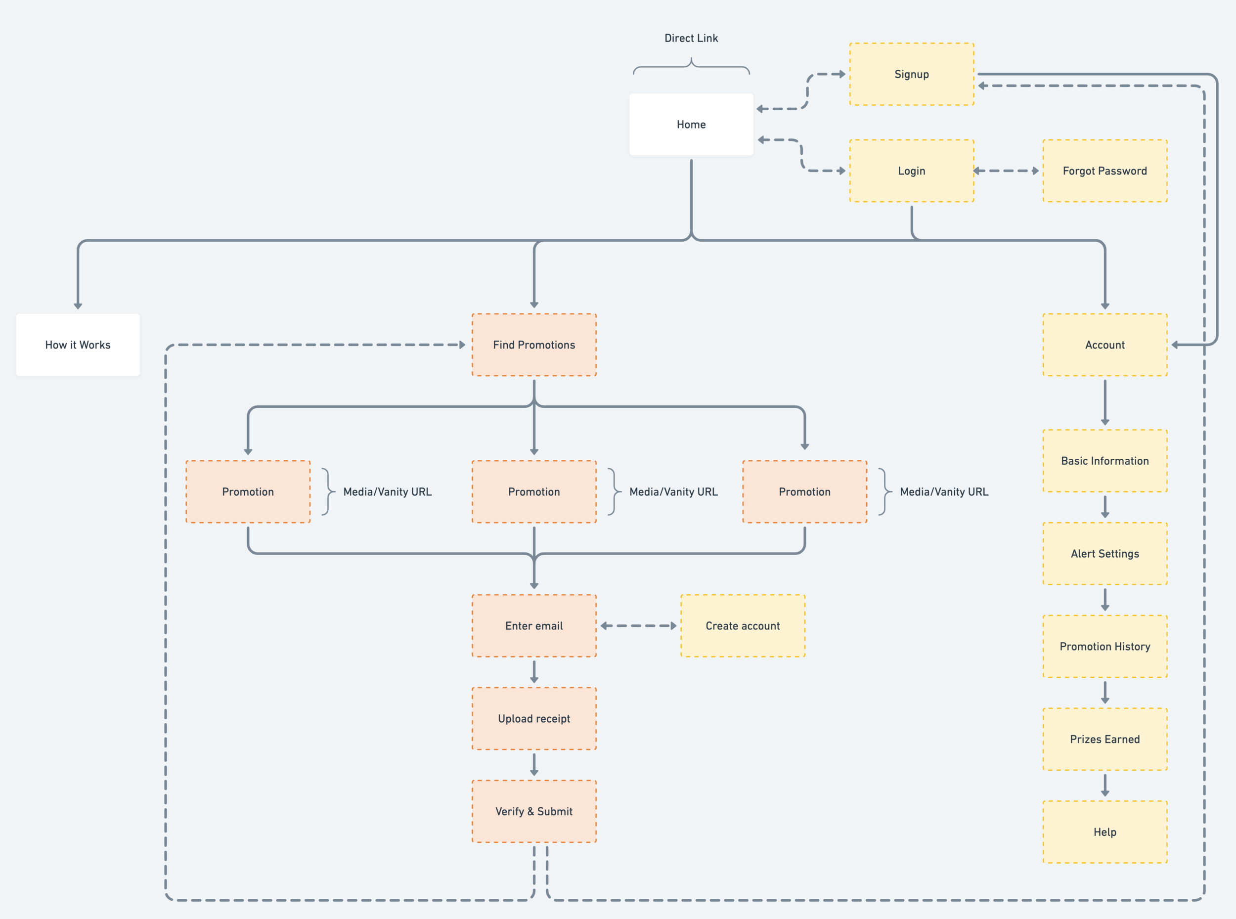
Rewards Hub initial user flow
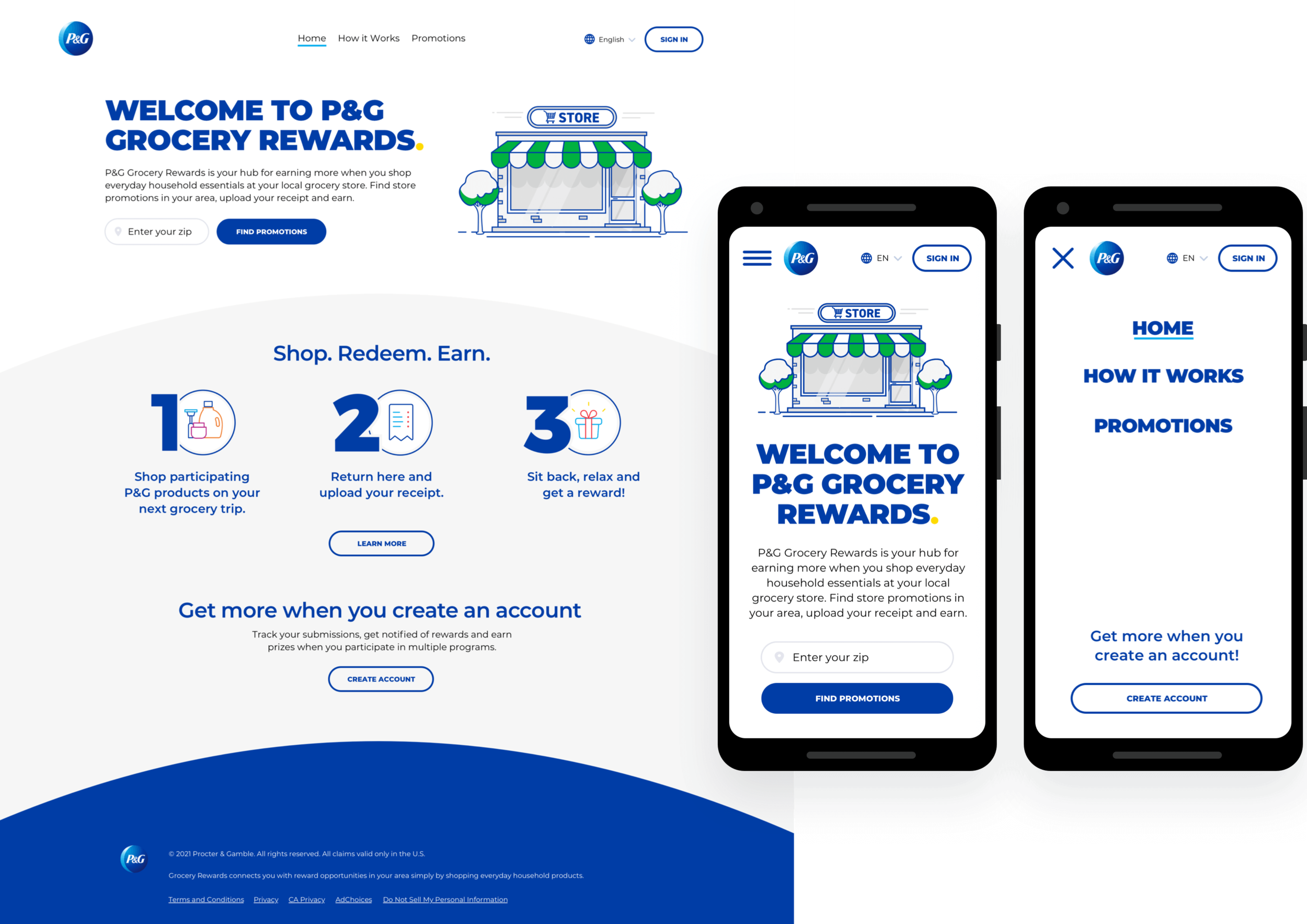
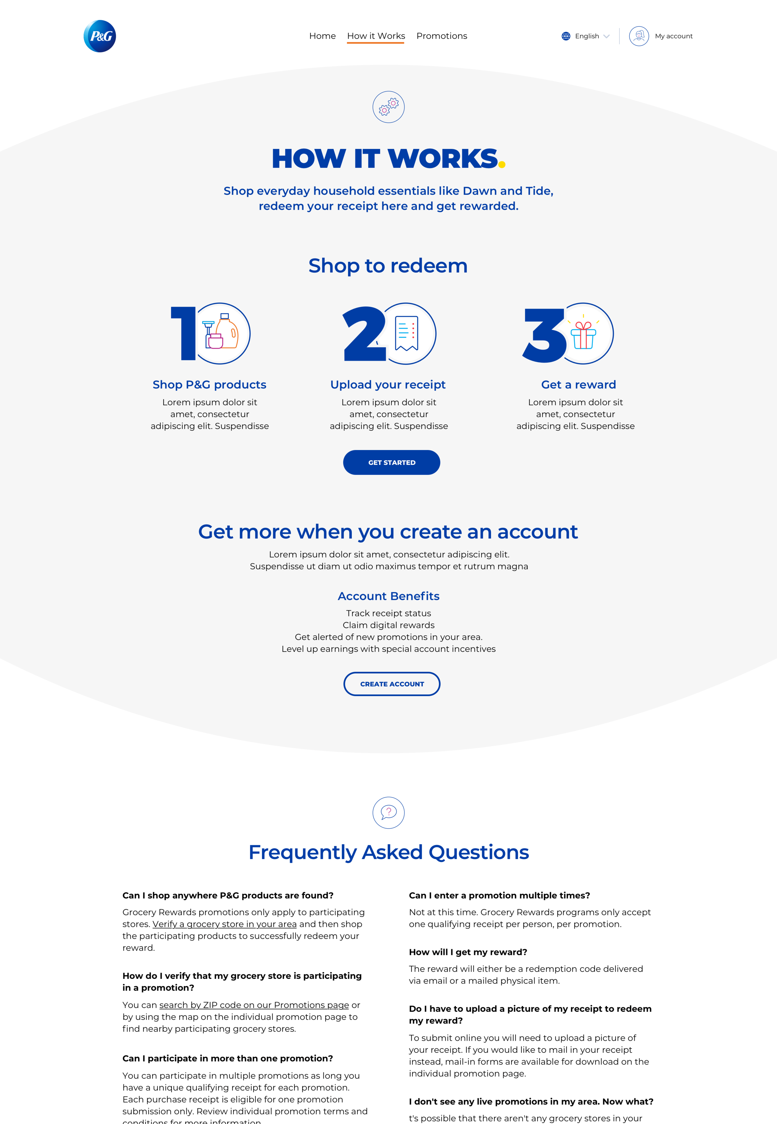
home page
For new users, our goals are awareness and conversion. For users who have no existing knowledge of Scale promotions, we need to educate them about the purpose of the platform and encourage them to shop participating P&G products. We outline the basic 3-step process directly on the home page with an additional driver to view a How it Works page, which goes into further detail on the 3 steps to redemption and includes FAQ about the promotion platform. In both locations, we outline the benefits of creating an account but expect that action to be secondary for new users.
From both the home page and How it Works, users can then take the next step to find available promotions by entering their zip code. We decided to offer 2 CTAS here: users can click through to the promotion landing page to read more about it if they haven't yet made a purchase or need to confirm requirements, or they can proceed directly to redemption.
For existing users, our goals are engagement and account creation. We wanted to make it as easy as possible for experienced customers to jump in and redeem their rewards as quickly as possible if they're already familiar with the process--the can search by zip directly from the home page and then click "redeem now" to save a click and get down to to business. We expect experienced users will appreciate the option for a more streamlined experience.
For repeat visitors, we hope to attract their interest in creating an account to make the redemption process even smoother--we've floated the idea of offering a welcome kit or other prize for account creation with our client stakeholders. If a user has already created an account and is logged in, they will also see custom messaging welcoming them back to the site.
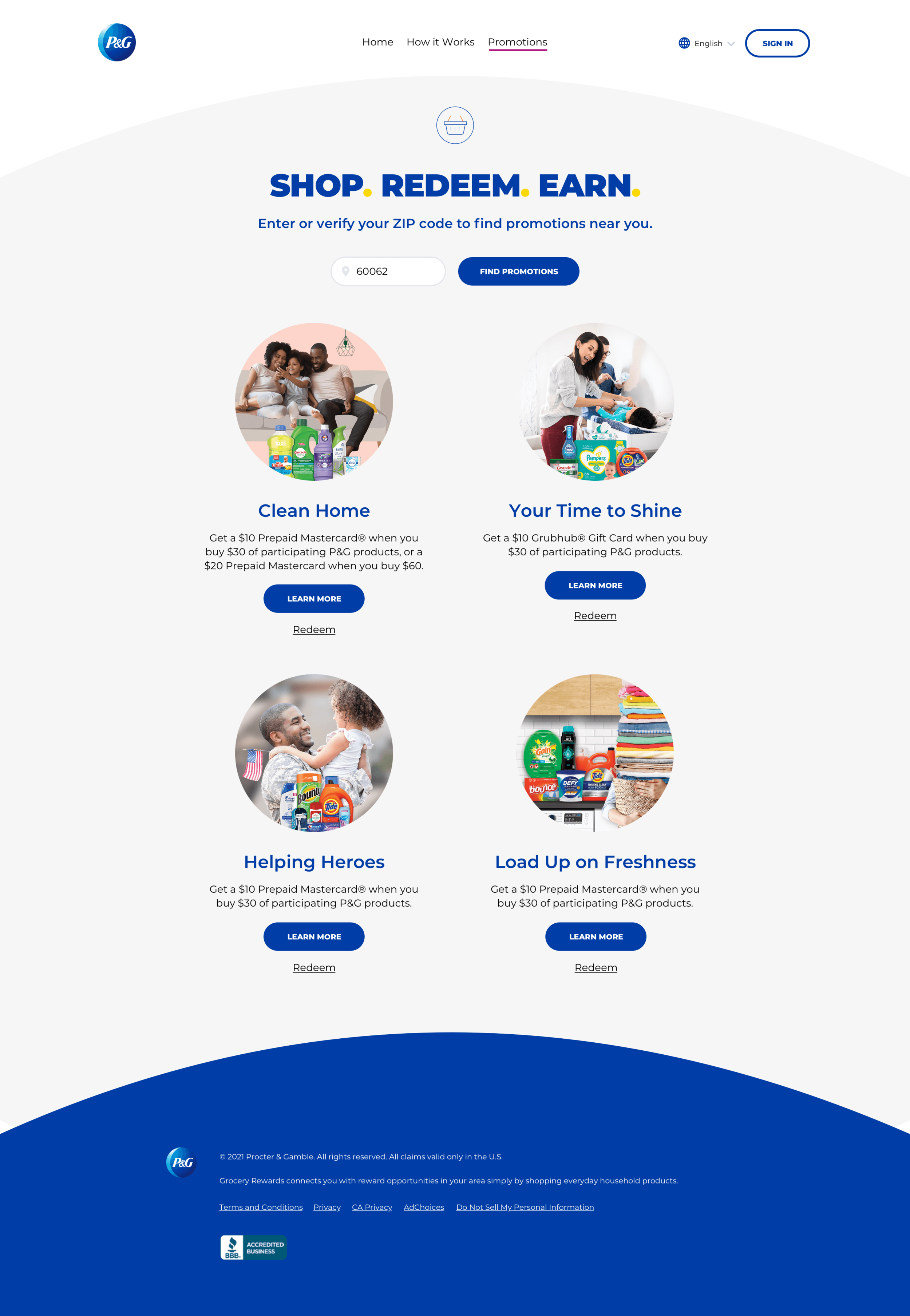
Direct to promotion
Most traffic to the Rewards Hub comes directly to promotion pages by a link from either digital media or in-store signage. Our goals for these users are conversion and redemption. Users who have not yet made a purchase need to learn more about program requirements and be enticed to buy products in order to receive their reward; post-purchase users are here to redeem their receipt as quickly as possible--sometimes directly after checkout or in their car in the store parking lot. We know the mobile experience is particularly important for these users.
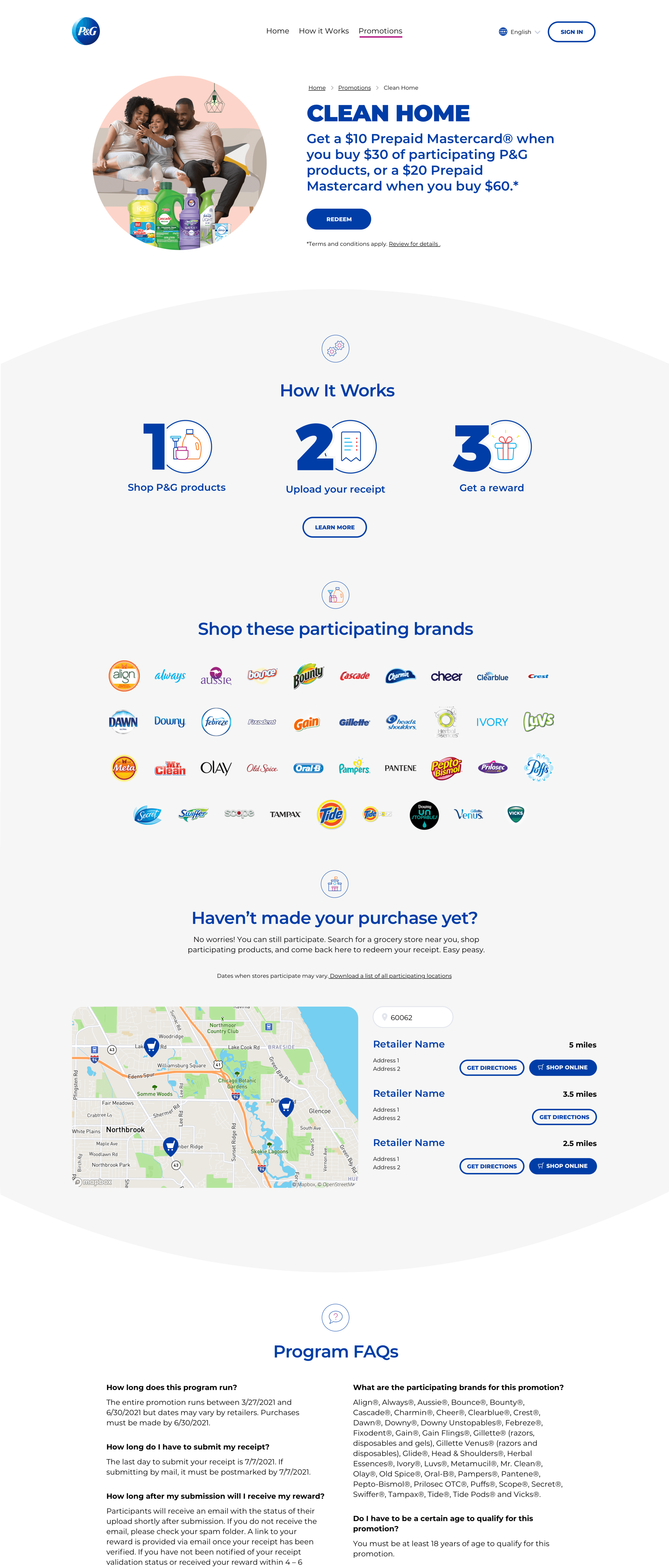
The structure of the promotion pages stays fairly close to what we developed for the TAGS programs. We want users to be able to confirm they can recognize the name and key visual for the promotion from the media that brought them here, quickly scan for the offer, and start the redemption process if they've made their purchase. Below the hero section designed for rapid redemption, there's a lot of additional information to convey to interested users.
3 step process: because we've built out a robust page for "how it works" details, we're able to keep the 3 steps on the promotion page brief with a driver to learn more
Participating brands: the logo grid allows users to scan visually to confirm the products they bought are eligible for the promotion but also underscores brand recognition
Store locater: users can search for participating retailers by zip code, which also encourages retailer buy in to the programs by creating an additional driver to their store. We are introducing a buy online functionality as well with our new product, which was not previously available on the TAGS platform.
Program FAQs: this content is different from the main site FAQ and includes program-specific information on participating products and general rules. Each program also has a dedicated customer service email and phone number, as well as a link to full terms & conditions.
Redemption Flow
We needed to keep the basic 3 steps to redemption user flow in place from our previous work with TAGS as much as possible. We briefly considered breaking the flow down further into 4 or 5 separate steps, but we decided against adding additional clicks for the user. The simplicity of messaging is appealing to users but also particularly important to retailers and P&G stakeholders in marketing these promotions.
Step 1: Enter email
Confirmation of which promotion they're participating in, now that there are multiple options
Prompt to create account: we want to encourage sign ups and users are already entering personal information at this stage—it's a familiar action now to create an account during check out
Store verification: we added this functionality to encourage users to double check requirements before they submit and attempt to reduce failed submissions----the most common error is the receipt is not from a participating retailer. However, the store listings are not always up-to-date so we didn't want to create a barrier to submission if users couldn't find their retailer via the store locator.
Step 2: Upload receipt
This is the most complicated step because users must annotate their receipt correctly before they upload the image in order for their submission to be validated
We surfaced the "helpful tips" content, which was previously hidden behind a tool tip
In previous iterations of the TAGS platform, this step also included legal opt-ins, but we chose to move those to the final confirmation step to minimize distractions
Step 3: Confirm submission
Success messaging with several conditional CTA options. The primary CTA is always "see more promotions" to encourage site engagement. If the user has created an account during the redemption process, they will see a message to look out for a confirmation email and validate their account. If the user has not chosen to create an account, they be asked again if they would like to do so. If the promotion they participated in has a game component, they'll also be prompted to play the game.

Screen recording of redemption flow prototype
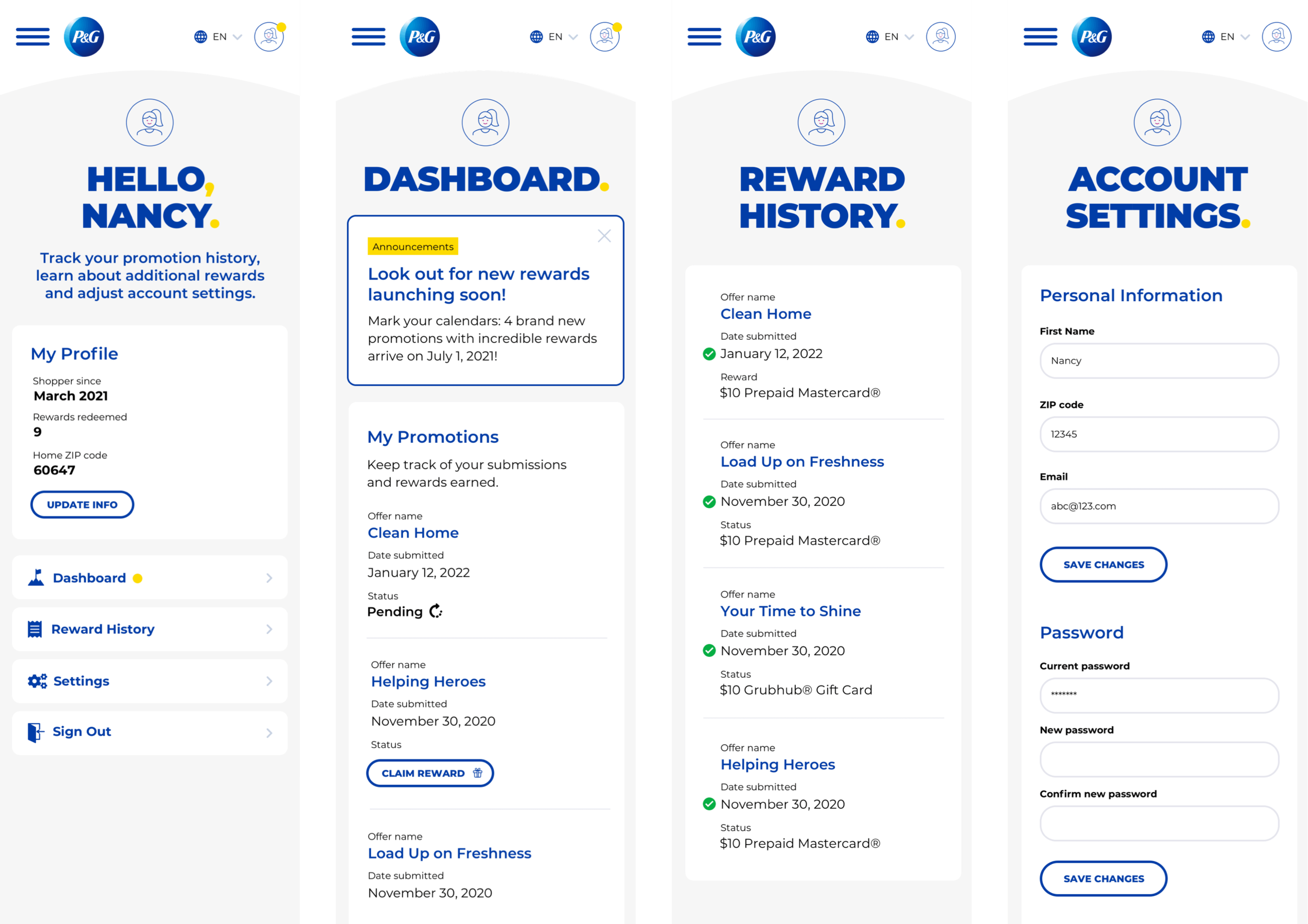
Account Features
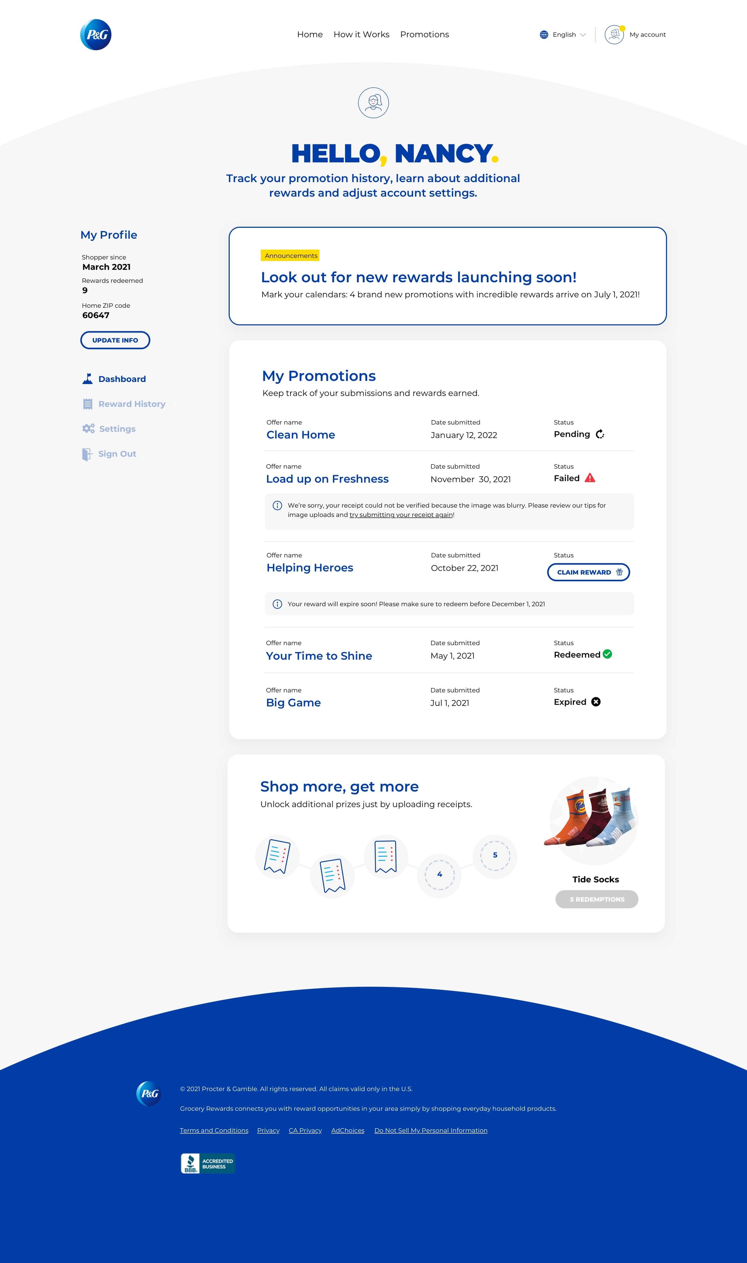
To support the loyalty aspect, we needed to provide users with a good reason to share their information and keep coming back to the Hub. The account dashboard serves a central place to see all their site activity, check on the status of submissions and rewards earned, update their personal information and potentially earn additional prizes for repeat participation.
Customized welcome message & reward tracker
Notification symbol displays on my account icon in nav bar when you have unredeemed rewards in your account
Dashboard
Upcoming programs: based on default location, a message will display when there are new programs launching soon in your area
My Promotions: displays status for current receipt submissions, as well as messaging on what to do for failed submissions and expiring rewards. Because reward validation and fulfillment are handled by 3rd party integration, status messages are currently sent via email only and the only other way to track status is by contacting customer service. The dashboard can potentially resolve a user pain point by providing additional transparency into the process.
Punch card feature: encourages users to participating in multiple promotions to earn additional rewards. We're planning to launch with a simple frequent shopper program but there's potential to expand this functionality in the future to drive sales.
Reward history: displays record of past successful reward submissions and earnings. This section also includes game and loyalty prizes in addition to receipt submissions.
Account Details: users can update name, email, default zip code, and password. We chose to ask for the minimum of personal information for privacy and ease of sign up.
Next Steps
We launched an MVP of PG Grocery Rewards in spring 2021 which you can view live now. Quarterly Scale programs are now hosted on the Rewards Hub and shoppers can search for and participate in available promotions in their area, but we're still building out the account features and full site structure with hopes to launch by the end of the year.
Usability testing
I ran a series of usability tests earlier this year on both the MVP functionality and prototypes of our planned account features. We wanted to ensure that users could successfully navigate the 3-step reward redemption process we've been employing for several years and identify pain points for future improvements, as well as gather feedback to refine our new features.
Most testers had an immediate positive reaction to the P&G brand and several expressed interest in participating in these type of promotions in the future. We found testers had a clear understanding of the 3-step redemption process and account features; most described the functionality as easy & intuitive
However, some testers who viewed the prototype starting from the home page (to mimic organic site traffic) were confused by the type of rewards available and the mechanism for earning rewards, so we need to revisit our home page strategy and overall messaging around what “rewards” mean for the user.
White label product
We’re also exploring the potential to white label the Rewards Hub platform and offer it as a larger scale rewards and loyalty solution to other clients, as we've had great success doing with TAGS in the past.