Victoria Fine Foods
Role: Visual Design & UX Lead
Victoria Fine Foods came to my team as part of the B&G brand family—they were in desperate need of a redesign for their outdated website to bring it up to current standards and make it easier to admin, but they also wanted to create a full-featured, sophisticated brand site to showcase their products as the high-end choice in a crowded marketplace. As one of B&G’s flagship brands, Victoria had the budget for additional features and design customization beyond the scope of the White Label design system.
Victoria’s pasta sauces have roots in tradition, but they also wanted their brand to appear modern, forward-looking, and innovative. Their target consumer was a modern mom who wants to cook from her grandma’s sauce recipe—health-conscious with an interest in how their food is made, but willing to try new things. With that in mind, we designed a glossy, contemporary site with a focus on recipes and high-quality ingredients.
Read more: Premium Branding | Navigation Overhaul | Ingredient Story | Recipes | Product Filtering
Premium Branding
We analyzed the competition and found that other supermarket sauce brands positioned themselves as a family-friendly, convenience food but still healthy & fresh. They used bright bright primary colors, chunky sans serif fonts, and homey food photography. To establish Victoria's brand difference, we decided lean into “premium” branding by carrying through the luxury heritage aesthetic they used for their packaging:
Retro type styles, rich accent colors, and a subtle gold foil texture to echo the label design
Paired with modern neutral tones and contemporary light, all-caps type combined with a classic serif to keep the vintage details from feeling too heavy or dated
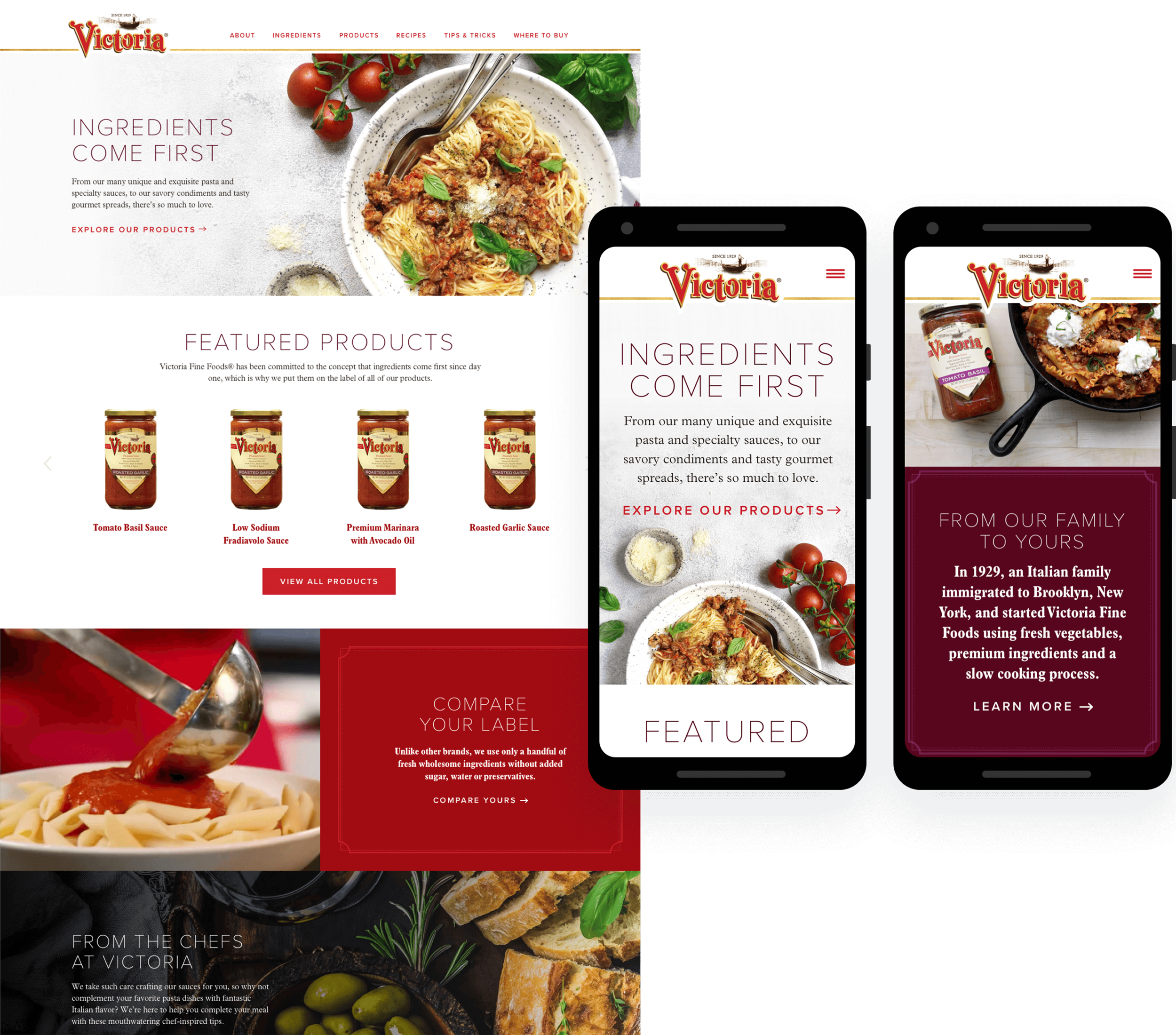
We also needed to create a cohesive look & feel using primarily stock photography, because their existing assets were limited. We also needed to find ways to show breadth of usage, since there was minimal visual differentiation between different flavors of sauce in packaging,
We looked for contemporary styling to balance the more traditional branding elements and an earthy, naturalistic aesthetic for flavor appeal imagery to represent the fresh, high-quality ingredients used in the product. We also leaned into the super-premium brand story with aspirational styling: marble and slate backdrops, rustic linen, fresh garnishes

Navigation Overhaul
In our content audit, we found the nav relied on confusing drop-downs. Sub pages didn’t correspond to parent items, naming wasn’t intuitive, and valuable content was only accessible via footer and/or internal page links.
Our solution
We simplified the top-line navigation and removed the drop down functionality. We also restructured content to remove outdated campaigns and highlight recipes & lifestyle content that were previously buried, as well as introduced a page-level sub nav in places we needed to combine smaller pieces of content to tell a larger story.

Before and after site navigation

Notes on navigation restructuring plan
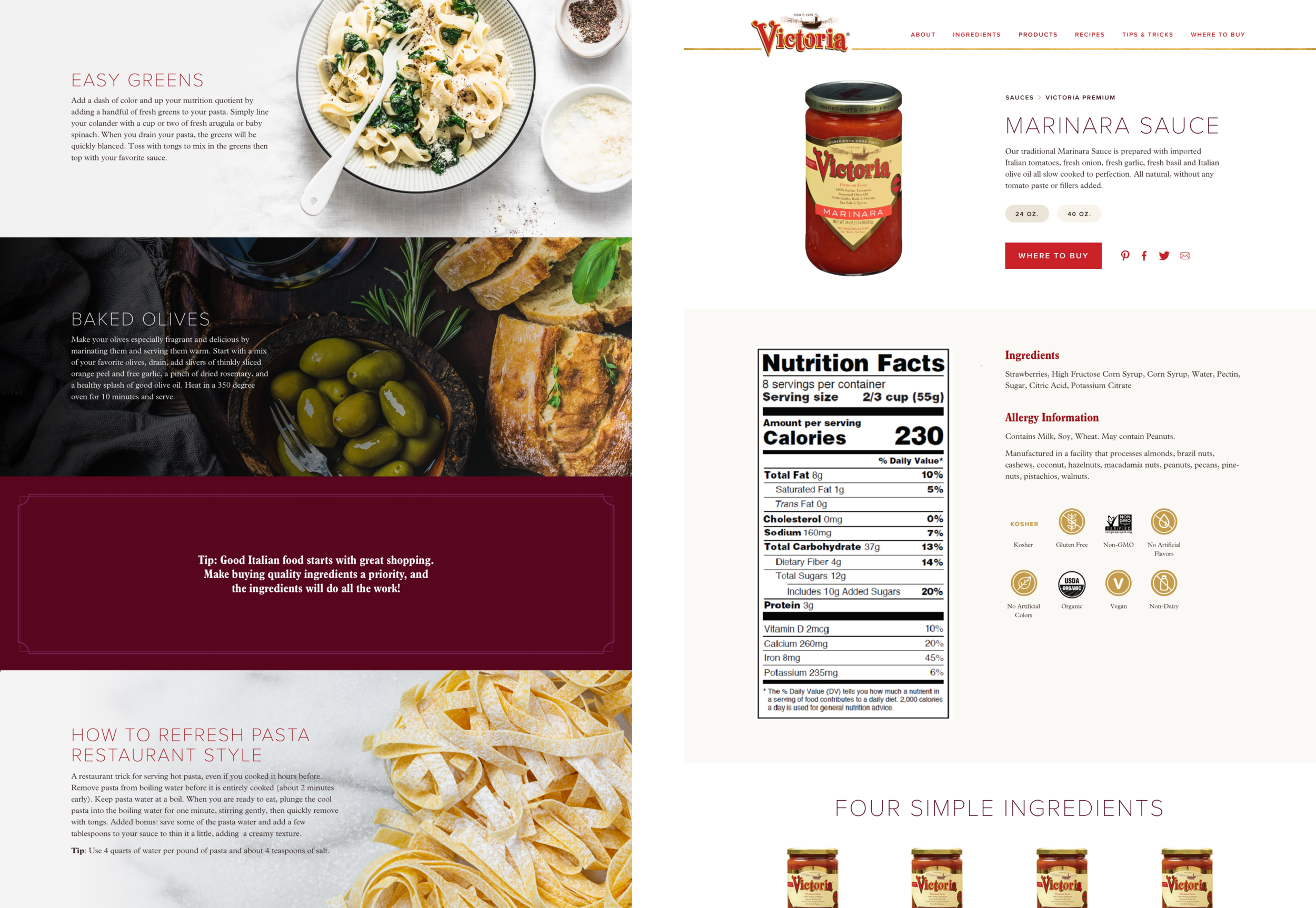
Ingredient Story
Victoria's simple ingredients and old-fashioned cooking process were an indelible part of their brand identity. While all grocery store brands emphasize the freshness and simplicity of their ingredients, Victoria’s were genuinely minimal. The fact that their list of artisanal ingredients was so short, it could fit on the front of the package label was a huge point of pride for the brand.
Though they were ready to move on from a previous #readyourlabel social media campaign, they had an existing feature they loved that underscored their brand difference by offering a side-by-side ingredient comparison with their competitors. We needed to carry the functionality forward to our new site while upgrading the functionality and design.


Bringing Recipes to Life
The existing recipe section was small and hard to find, and also hampered by low-quality photography and a clunky, non-responsive interface. In our site audit, we found downloadable PDFs with more recipes and cooking tips that we could leverage to show off product versatility and add lifestyle interest. To drive traffic to a key content area, we promoted recipes to the top nav.
On the recipe landing page, we modernized the card treatment and added a search bar, as well as filtering by occasion and product, to make the recipe section easily navigable as we significantly expanded the available content.
For the individual recipe pages, we wanted to showcase our great photography: the high-end stock images we’d sourced as well as the client’s plans to shoot new recipe content in the near future to give users a cookbook-like experience and underscore the premium nature of the brand.
We knew this would appeal to their target audience and help Victoria stands apart from their competitors, who focused on quick, family-friendly recipes presented in a blog style.
Key design features
Dramatic full-viewport photos and large title type
Info bar with serving information and share functionality
Clean 2-column recipe layout
Featured recipes to encourage users to keep exploring


Recipe landing page before and after


Product Filtering
The existing product organization was was overly complicated and didn’t offer the ability to see all products at once or compare sauces across product lines; finding non-sauce products required extra level of navigation.
It was also extremely unclear how to access more information on individual products: users had to click to open a modal and then click again on the product image to view nutrition and ingredients with no hover interaction.
Our solution
We reorganized the products into 2 groups: sauce or non-sauce. Users could then select individual product lines or sub-categories from within those groups. We also added a keyword search to make it easier for users to find their preferred flavors or ingredients across product lines.
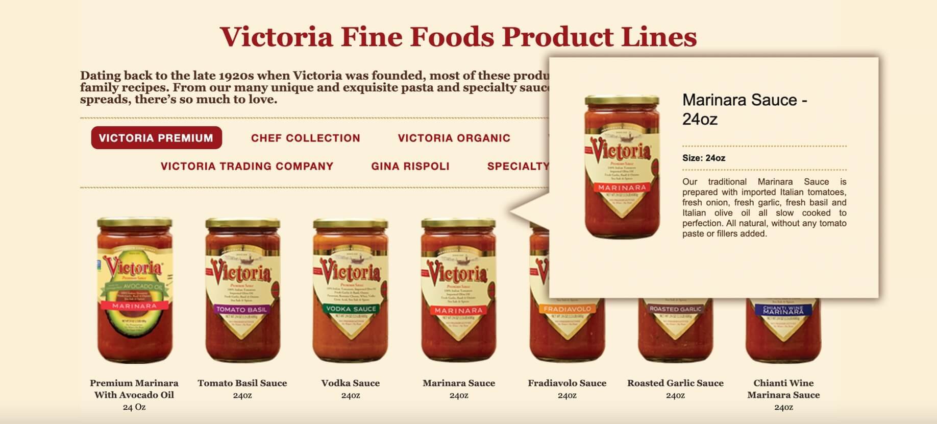

Original product filters and notes on filter reorganization
