White Label Design System
Role: UX & Design Lead
B&G Foods is the parent company of over 50 food brands, including household names like Ortega, Cream of Wheat, Mrs. Dash, and Bear Creek. Most of their brand sites were sorely out of date, but also built on a variety of different back-end platforms due to acquisitions over time. They had an urgent business need for us: they wanted to redesign the websites for their entire brand portfolio and bring them all together on a common CMS platform. Our role was to simplify and organize B&G Foods' digital presence for internal efficiency but also to provide a strong platform for brand promotion and an updated, mobile-friendly experience for their customers.
Major Challenges
Migrating, redesigning, and relaunching websites for over 50 brands on a new master content management system. Time and cost were primary business concerns for the client
Creating an overarching design system to streamline the process, by identifying common components for retail food brands that we could then perfect in an unbranded “white label” format across all devices and viewports. We could then combine these components and customize depending on each brand’s needs
Trying to cover all contingencies with the master system, including inconsistent data, inconsistent brand guidelines, varying quality of assets, massive scale
Read more: Components | Product & Recipe Organization | Design System
white label Components
Working closely with the full product team, the content strategy and UX teams completed a full audit of every single brand site. We looked at what kind of content already existed, how many products and recipes each brand had, what kind of categories and organization they used for products and recipes, and what kind of nutrition data was associated with products.
Using our audit findings, we grouped the brands into categories by existing content and level of effort:
Small sites: brands with minimal existing content, few products, poor quality or no recipes, little internal support for additional content creation. URL will redirect to a fully templated landing page on the B&G corporate site with brand story and product pages for easier management.
Medium sites: mid-size brand sites will retain unique domains but share a common architecture & structure. They’ll have a semi-templated layout built with white label components, customized with brand look & feel. In addition to small site features, they may have recipes, FAQ, and digital coupons
Large sites: flagship brands with a larger profile and budget, these sites will leverage white label components for basic structure but have a custom layout and additional features/functionality based on brand needs. Examples: games, blogs, expanded recipe or product page templates, animated elements

Initial category breakdown for 53 B&G brand sites
We decided the best approach for a project of this scale would be to create a suite of site components that we use as building blocks for each individual brand site. As a team, we mapped out all the components we’d need, documented requirements, and planned variations. In planning, we needed to consider both the consumer use case for the end product and brand managers at B&G who’d be updating their websites in the admin system.


We created wireframes and minimally branded designs for each component in desktop, tablet and mobile form, then worked closely with the development team and QA analysts as they built and tested each component, making adjustments every step of the way. Even as we began building out the branded sites, we continued to update and improve the core components, or add new ones as needed.
Example component types:
Home page content blocks that could be adapted and used in different arrangement to create a semi-custom home page for each brand
Navigation bar & footer, including logic for the order of nav links and how they display based on varying content needs across site portfolio
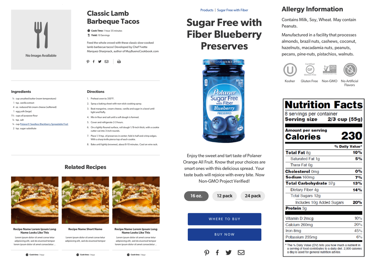
Recipe & product cards
Product data blocks including product image, description, ingredients, allergen and nutritional claim icons, nutrition panel
Recipe data blocks including recipe image, description, servings & cook time as available, ingredient list, directions
Breadcrumbs
Language toggle for bilingual sites
Contact form
Brand story page

White label home page blocks for desktop and mobile
White label product and recipe components
Product & Recipe organization
The most challenging piece of the component system was developing filters. In the course of our audit, we'd found the existing sites used wildly different and often inefficient criteria for their filters. We knew we would need to create a common set of filters for products and recipes that could apply globally to all B&G sites.
Search
We determined global keyword search wasn't necessary or valuable on sites of this size, considering the time and budget constraints—filtering or searching within products and recipes will accomplish relevant search tasks on the majority of the brand sites as their content outside those pages will be minimal.
Filters
We set parameters around when filters would be used in which combinations, depending on the number of products and recipes, as well as individual brand needs. We also designed the basic UI for displaying 1, 2, or 3 filters along with a search field when required. Products would be sorted alphabetically with the option to pin featured products to the top of the list; Recipes would be sorted by date added.
Product filter options
Category: based on product line/sub brand
Dietary: based on dietary limitations or specific brand claims
3rd filter if the site content warrants it: seasonal, promotional, new etc.
Recipe filter options
Main ingredient: protein, product category, etc.
Product: list of all brand products
Meal type: category, occasion (breakfast, lunch, dinner, game day, cocktail party etc)

White label product filters

Final recipe filters for Polaner Spreads based on white label components
design system
We knew we had a very aggressive timeline for the project and needed to expedite the individual site designs as much as possible. To accomplish this, we established a White Label style guide template that included forms, buttons, fonts, icon sets, and a limited palette of brand and UI colors. We wanted our template to feel polished enough that we could launch a site with minimal updates by swapping in colors and type styles, but be flexible enough that each site would feel unique. We also created a type scale to pre-set all our text sizing and adjust for responsive scaling. As we went along, we’d also adapt or remove style guide items for future efficiency—the work we put in up front on the design system helped us work quickly without sacrificing good design.

White label style guide template

Style guide customized for Bear Creek Country Kitchens
Some brands had robust brand guidelines or recently redesigned packaging and marketing to draw from as we designed the new sites; others could provide a logo and 1 to 2 brand colors at best and we’d need to craft the brand’s look and feel ourselves from the ground up. To get buy in from the brand stakeholders early in the process and minimize the need for mockups, we put together a style tile for each brand to show our recommendations for colors, typography, image selection, and basic site elements in an easily digestible format. When all parties were happy with the overall aesthetic, we could jump quickly into design but also apply new insight as we customized existing white label components to give each site its own distinct look & feel.
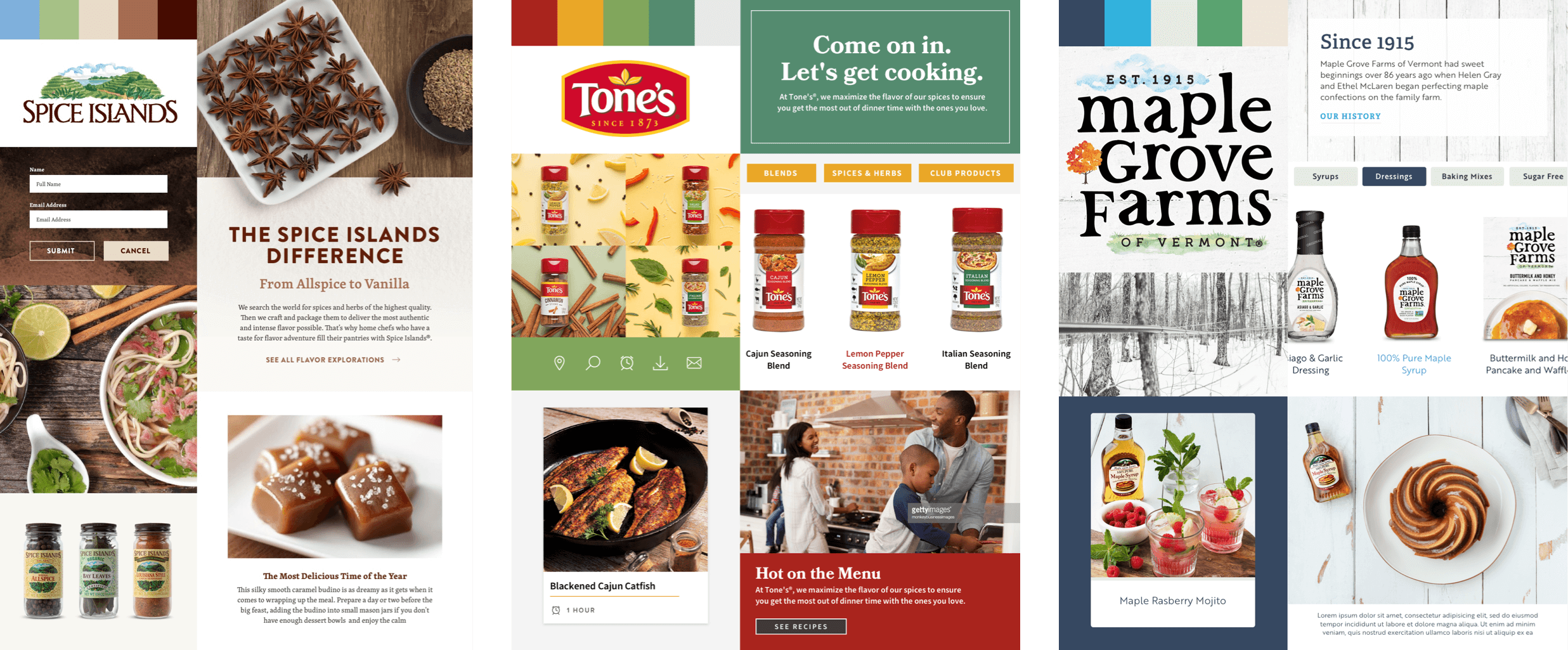
Above: Style tiles for several of B&G’s brands—these were shared with the brand managers as a snapshot of the look and feel we would later layer over the White Label components to create customized branding for their sites. Below: Completed site components for various B&G brand sites based on the White Label system.

